Photo by Hal Gatewood on Unsplash
Importance of UI design in creating user-friendly and intuitive interfaces
Importance of UI design in creating user-friendly and intuitive interfaces
UI design is crucial for the success of digital products because it directly impacts user experience (UX), which is a key factor in user satisfaction and retention.
A well-designed UI can improve usability, reduce user errors, and increase user engagement and productivity.
Therefore, interaction modelling and design is an essential aspect of UI design that helps create interfaces that are both functional and aesthetically pleasing.
Command Language
A screenshot of a keyboard shortcut menu in Adobe Photoshop
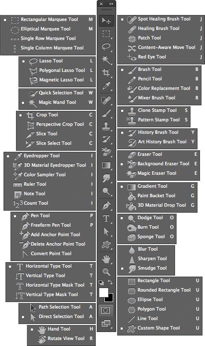
Users can access various commands and tools in Photoshop using keyboard shortcuts instead of having to navigate through menus or click on icons.
Keyboard shortcuts can help users perform tasks more efficiently and quickly, and can also be customized to match user preferences.
Why this feature is effective for the user:
Keyboard shortcuts can speed up the workflow for experienced users who are familiar with the specific commands and shortcuts.
By reducing the need for mouse clicks, keyboard shortcuts can also minimize the risk of repetitive strain injuries and improve overall productivity.
In addition, users who prefer keyboard input over mouse input may find this feature more accessible and comfortable to use.
Menus
Menus are graphical user interface elements that display a list of options or commands for users to choose from. They can be hierarchical or flat and can be accessed by clicking on a button or icon, or by using a keyboard shortcut.
1. Dropdown menus
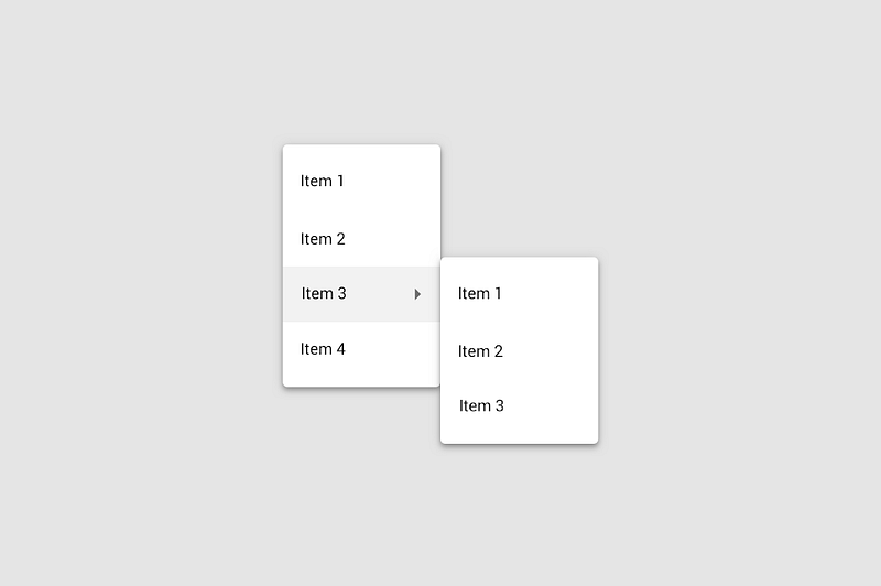
Dropdown menus are typically used for displaying a list of options in a compact format
Dropdown menus are usually triggered by clicking on a button or arrow
Used to provide a set of options that apply to a particular task or function
2. Context menus
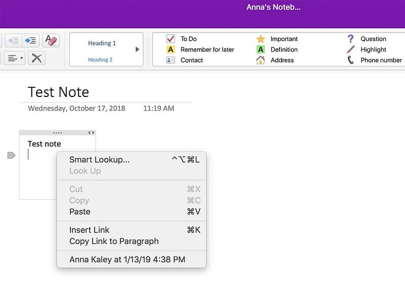
Context menus are typically triggered by a right-click or long-press action on an object
Designed to provide options that are relevant to the object that was clicked
3. Pop-up menus
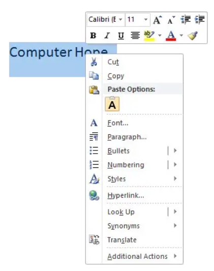
Pop-up menus are usually triggered by specific actions, such as hovering over a button
Pop-up menus are similar to context menus in that they both display a list of options for the user to choose from. However, pop-up menus are typically used for more complex or multi-step actions, while context menus are used for quick actions or shortcuts.
4. Menu bars
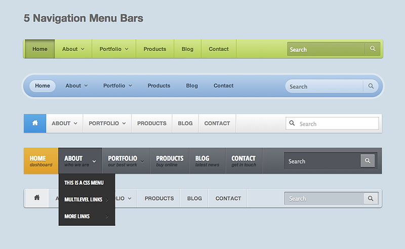
Menu bars are a common interface element that provides access to various commands and features
Pros and cons of menus:
Menus can help organize and structure information and can provide users with a clear understanding of the available options. They can also conserve screen space and reduce visual clutter.
However, menus can also lead to more clicks or interactions required to complete tasks, which can slow down the user’s workflow. In addition, too many nested menus or too many options can be overwhelming and confusing for users.
Therefore, it’s important to design menus with the user’s needs and preferences in mind and to balance their use with other interaction modes to optimize UX.
How this feature works and why it is effective for the user:
Provide a structured and organized way for users to access different options or functionalities. Menus can be presented in various formats, such as dropdown menus, context menus, or hamburger menus, and can be customized to fit different use cases and user needs.
Forms
Forms are graphical user interface elements that enable users to input or submit information, typically through a series of fields and labels. Forms can be used for a variety of purposes, such as registering for an account, filling out a survey, or submitting a payment.
1. Registration forms
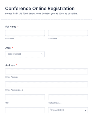
Registration forms typically require users to input their personal information, such as their name, email address, and password.
2. Contact forms
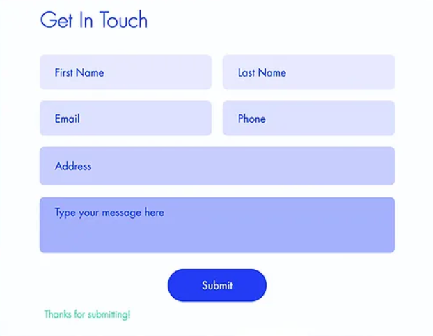
Contact forms provide a way for users to get in touch with the website or app’s owner or support team
3. Search Forms

Search forms allow users to search for specific content or products on the website or app
4. Checkout forms
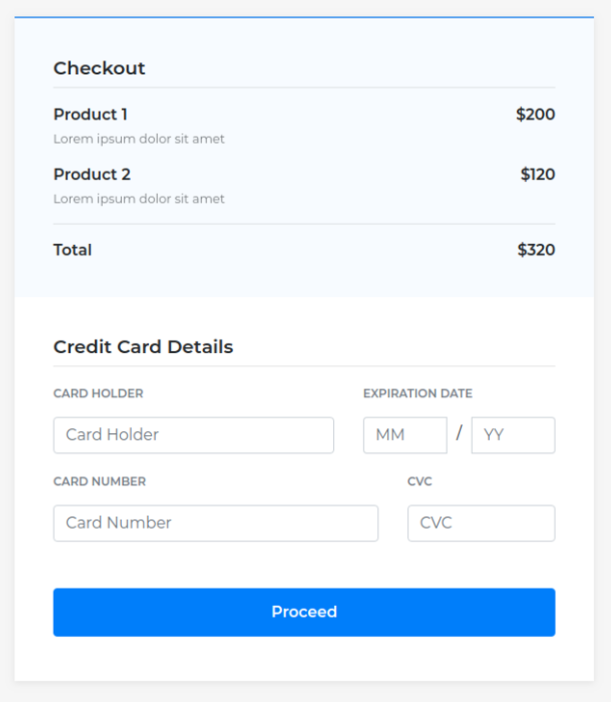
While checkout forms enable users to complete a purchase by inputting their billing and shipping information.
Pros and cons of forms:
Forms can provide a structured and organized way for users to input or submit information and can help minimize errors or typos through validation and confirmation messages. They can also provide a way for users to save their progress and return to the form later.
However, forms can also be time-consuming and tedious for users, especially if they require a lot of information or have complex validation rules. In addition, poorly designed forms with unclear labels or confusing layouts can lead to user frustration and errors.
Therefore, it’s important to design forms that are clear, concise, and user-friendly, and to minimize the number of required fields whenever possible.
How this feature works and why it is effective for the user:
Forms are an effective feature in UI design because they allow users to input or submit information in a structured and organized manner. By breaking down the input process into smaller fields and labels, forms can help users understand what information is required and how to provide it. Forms can also help minimize errors or typos by providing validation and confirmation messages, such as requiring users to input their email address twice to ensure it is correct.
Choosing the Right Interaction Mode
User task: Consider the task or goal that the user wants to accomplish, and choose an interaction mode that supports and facilitates that task. For example, a direct manipulation interface may be better suited for a graphic design application, while a command language interface may be more appropriate for a software development tool.
Device type: Consider the device that the UI will be used on, such as a desktop computer, smartphone, or tablet. Different interaction modes may work better or worse on different devices, based on screen size, input methods, and user preferences.
User skill level: Consider the skill level and experience of the user. Novice or casual users may prefer more visual and guided interfaces, while experienced or power users may prefer more efficient and customizable interfaces with advanced features.
When selecting and designing interaction modes, here are some best practices to follow:
Use a variety of interaction modes: Different users may prefer different interaction modes based on their preferences and skill levels. Providing a variety of interaction modes can help accommodate different user needs and preferences.
Prioritize simplicity and ease of use: Complex or confusing interaction modes can lead to frustration and errors for users. Prioritize simplicity and ease of use in your UI design, and avoid unnecessary complexity.
Test and iterate: User testing and feedback can provide valuable insights into the effectiveness and usability of different interaction modes. Test and iterate on your UI design to refine and improve the interaction modes over time.
Here are some examples of successful UI’s that use different interaction modes effectively:
Adobe Photoshop: Photoshop uses a direct manipulation interface to allow users to edit and manipulate images with precision and control.
Slack: Slack uses a combination of menus and forms to allow users to navigate and communicate with teams and channels effectively.
Microsoft Excel: Excel uses a combination of direct manipulation and command language to allow users to input and manipulate data efficiently and accurately.
